Power Notes
UI • UX • Research • School Project
Team Members: Akar Singh, Akhilan Ganesh, Asya Balas, Brian Tran, Ivan Ozerets, Praneet Bhoj, Ryan Shamoon, Thanh Huy Le
Students in college and professionals in the business world have a lot of responsibilities to handle. Not only do they have to worry about passing classes or advancing in their career, but they also have matters to deal with in their personal lives. Amidst all of the lectures and meetings, deadlines for projects, lunch meetings with others, and appointments to keep, there is much to keep track of. In a world where time is money, you never want to lose a second, so being kept on track is critical. And even outside of the workplace or lecture hall, keeping up with events and plans in your personal life is important as well. Regardless of what area of life it’s for, keeping a record of events and appointments will help improve one's timeliness and efficiency. These things in turn can improve one’s standing in the workplace or academia, help one make connections in the business world, and broaden one’s relationships in their personal lives.
Hey, this looks familiar!
Project Overview
In the winter quarter of 2021, my two teammates and I created as a class project, a combo gratitude journal and mood tracker app, called Mooditude (link to Mooditude's case study). This project was for an interaction design class, heavily focusing on the design process of the app.
Since Mooditude was my first real application that I designed and developed, there was a lot of room for improvement in the finished product. I also learned much about web app development during that process that I learned too late to apply to Mooditude. By having the opportunity to try another attempt at a journal based product, I was given the chance to directly apply all that I had learned from Mooditude to improve the software that I helped create.
Spot the Differences
What is a Bullet Journal?
While in the previous quarter I helped design a gratitude journal, this quarter the journal that my team set out to create a web app for is a Bullet Journal. A Bullet Journal is a special type of journaling process designed by Ryder Carrol. It involves a special method of taking notes that allows users to make quick entries into the journal (called rapid logging) and the user then assigns a descriptor to the entry (task, note, or event). Once the entry is written, which any entry is usually only a sentence or two, the user can move on and go about their day, until they review their entries at the end of the day in a process called migration. Migration is where the user moves any entry that has not been finalized yet into either a log for the next day, for the next month, or even for the entire year.
To design a Bullet Journal app, my team quickly realized that our design must be fast and accessible for users, so that they can write down entries quickly and efficiently. By doing this we would satisfy the principle of rapid logging, but there was also a difficulty to designing for rapid logging. This issue is that while the app should be quick for writing entries, we needed our design to also encourage the user to take time to review their entries to satisfy the principle of migration. This created an interesting dichotomy of needing to design an app that was sometimes quick and accessible for the user, but at other times encouraged the user to use the app slowly and review their entries. Thus, with our challenge presented to us, my team and I set out resolve this problem and create our app.
What do I Bring to the Table?
My Insights
Because of my previous work on Mooditude, I was excited to work on a Bullet Journal app and to have an opportunity to improve on my journal app design skills. Most of the tools I used for Mooditude were also used for this app and I had also gained a great deal more experience with HTML, CSS, and JavaScript. Some of the user insights I gained last quarter were also helpful here, with adding features like encouraging quick and easy to write journal entries for busy people, or including multiple color themes for those who like to customize their journals. Through my prior experience I was able to give my team insight and helped lead us in the right direction, as well as offer advice to my teammates that had less experience than me.
Getting our Hands Dirty
Designing the Bullet Journal
While we were all anxious to start coding our app, we also knew that we had a lot of work to do before we could even start writing code. Like constructing a building, we had to lay our foundations through our design work before we could start building upwards. For this class, we started first with researching Bullet Journals and other existing products, before coming together as a team and deciding what we felt was essential to the app that we were creating.
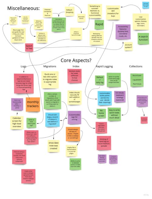
While planning for the app, we first threw up all of our ideas up on a board using sticky notes (we used Miro for this step). We categorized them by core aspects of a Bullet Journal and then went and reviewed them as a team one-by-one. For each we color-coded them into different categories for what we planned for them. Additionally we marked which features might be related to each other, so we could plan ahead.
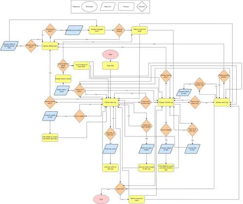
This is a system diagram for the bullet journal where we brainstormed how exactly the user might interact with our application. Here we can plan what we need to display to the user or what data we might need from the user based on their decisions.
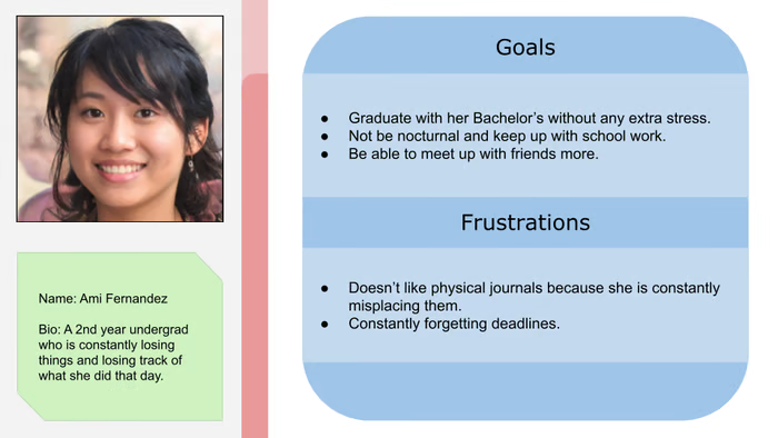
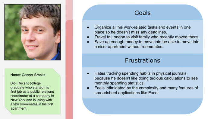
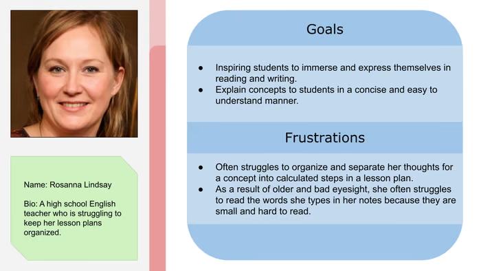
These are some of the user personas that we crafted for the Bullet Journal. We created these to help us pinpoint who some of our specific users might be and what problems they have that our app could help them solve. For our app in particular we wanted to identify any user who might use our app, rather than just those that might be likely to use it.
After dong the background work for the app, the next step was to move on to high fidelity designs and prototypes. We went through multiple revisions of our paper prototypes, working through each one as a team to identify what was good and to offer up suggestions for improvement.
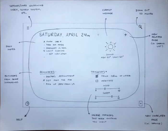
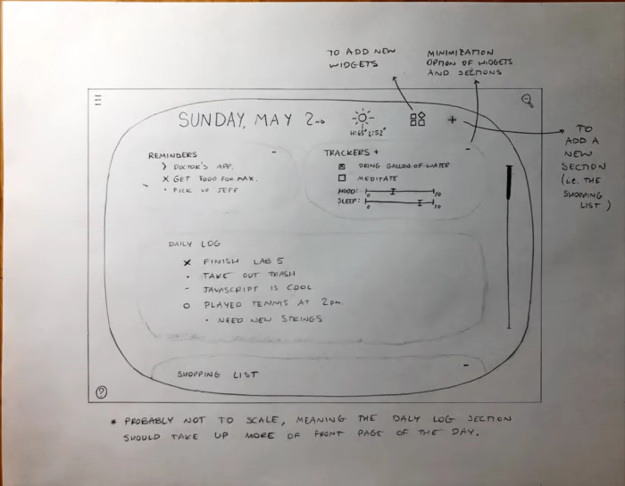
Next after paper prototypes is digital wireframes. Here we iterate on the paper prototypes to create a more realistic design much closer to what our final product might look like. Even then, however, as the project continues to be developed, we constantly had to update the design and make changes to polish our product as much as possible.
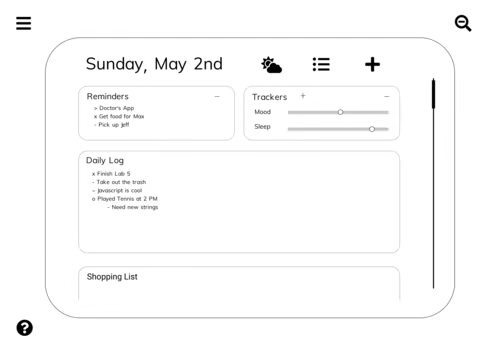
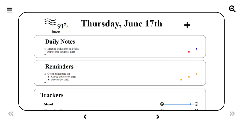
Here is the wireframe version of the paper prototypes shown above. The design has been cleaned up and further organized. We avoided using colors to focus on the overall design and we'll add in color at a later date.
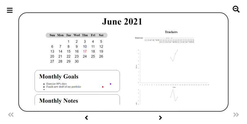
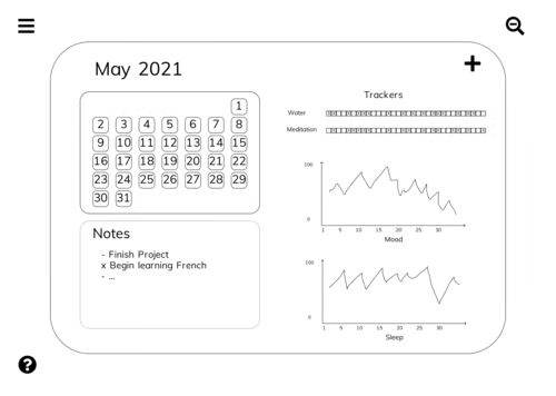
While before we were looking at a daily journal, this is a monthly page. Here user's can list monthly goals and objectives, as well as have data from the trackers displayed in graphs.
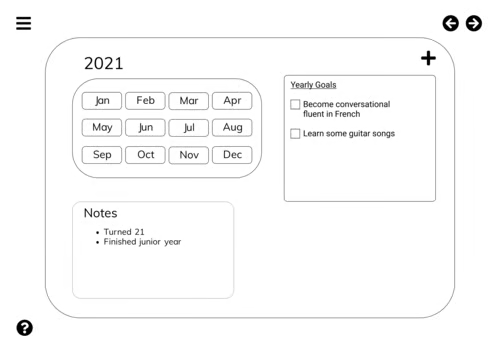
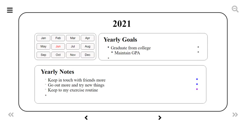
This is the yearly log, the next step up from the monthly and daily logs. This is where users can log their long term plans and goals for the year, or just make long-term note of things that are not immediately pressing.
Fruit of Our Labors
Final Product
After all of the preparation work, we finally were able to start work on coding the actual app. For this, we split into different sub-teams with each team focused on a different part of the design. Some teams were focused on frontend development and design of the app, while others worked on the backend, implementing storage and the actual functions that make our app work. Additionally, once enough of our app was developed, we had one team work on testing the app, performing both end to end and unit testing. I personally worked on the frontend of the app, but I frequently collaborated with the other sub-teams to ensure our pieces would come together smoothly. Additionally, I was also in the sub-team in charge of testing where I helped write many of the test cases for the app. Finally, due to all of our contributions, we completed our app and were able to present it to our instructors and the rest of the class on time.
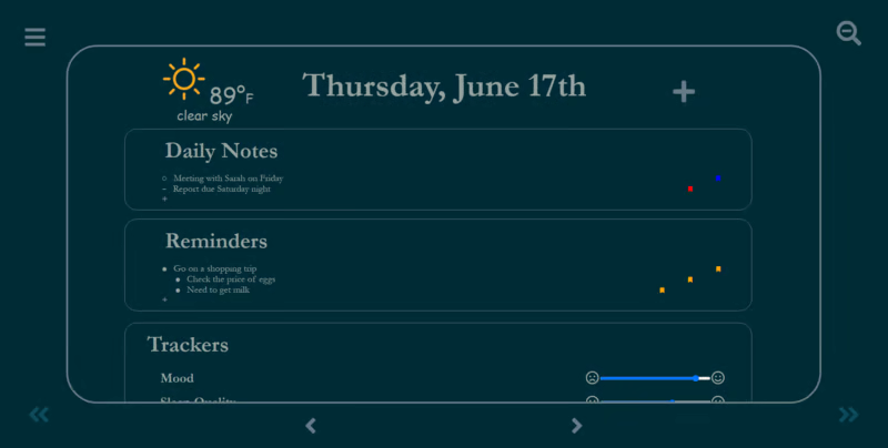
As part of this app we included different themes and fonts for the users to choose from. An example of one of these themes would be the solarized dark theme as seen below.