Mooditude
UI • UX • Research • School Project
Team Members: Arnav Aggarwal, Kriti Jain
As we all know, life is about moving forward, always pushing ahead to get the next big project done, whether it’s finishing up a school quarter, getting a job, or working towards that promotion. Indeed, time is a one way street. The problem is that we often get caught up in the flow of life, only looking ahead, but never looking behind.
Well, as it turns out, there’s a lot we can learn by looking back at what we’ve done and accomplished in life. We might see a pattern of behavior we might not like and want to change, or we might see something that is more important to us than we originally thought. Whatever it may be, we all have something that we can learn from the past that we can use to grow and improve ourselves in the future.
Hey, what are we doing?
Project Overview
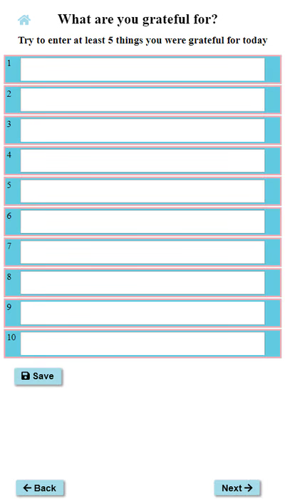
As a class project for an Interaction Design course in the Winter of 2021, my team and I choose to create a combo gratitude journal and mood tracker to help give people an app that allows them to quickly make journal entries and give them ample time to reflect on their history. Over the course of 8 weeks we designed and developed this app before presenting our finished product at the end of the quarter.
For this project I served as lead software developer and by the end I had written over 90% of the code that went into the app. My teammates took the lead on the design and more logistical sides of the project, coming up with wireframes and user testing processes. By the end, however, we each had worked and contributed to most parts of the final product.
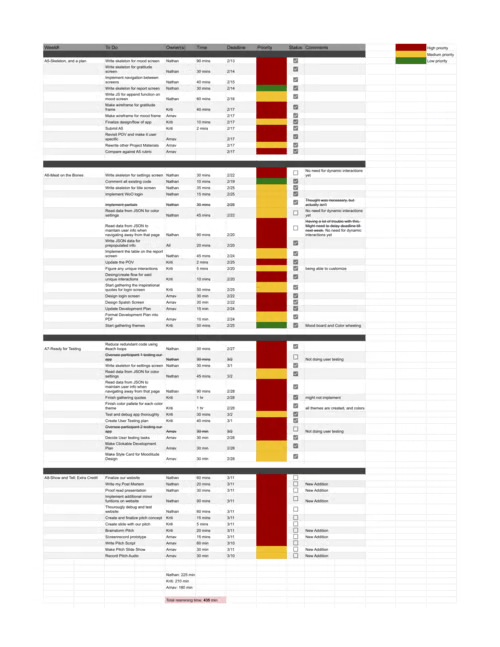
For this project we adhered to a development plan. Over the course of four weeks we fully wrote the code for the website and continued to further design and iterate on the app. Each week we would revaluate the development plan to make certain we were on track, readjusting time estimates or reassigning work when it was needed.
How did we even get here?
Early Development
In this class, we were given the freedom to choose what type of app we wanted to develop as a team. Our team was able to quickly decide on a gratitude journal as the type of project we wanted to do, due to shared interests in the app.
With the early stages of user testing done we were soon brainstorming ideas on how to tackle these issues in our app through methods like storyboarding and paper prototyping.
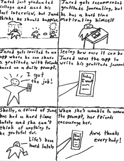
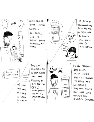
These pictures are storyboards from the early development stages of Mooditude. We used storyboards to try to identify use cases for our application and to envision who our users might be and why they would use our app. In this case specifically, we used storyboards to prototype different ways to encourage users to keep up with journaling.
The Bobs and Whistles
Planning Features
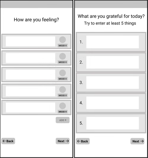
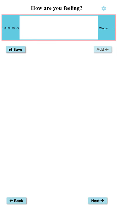
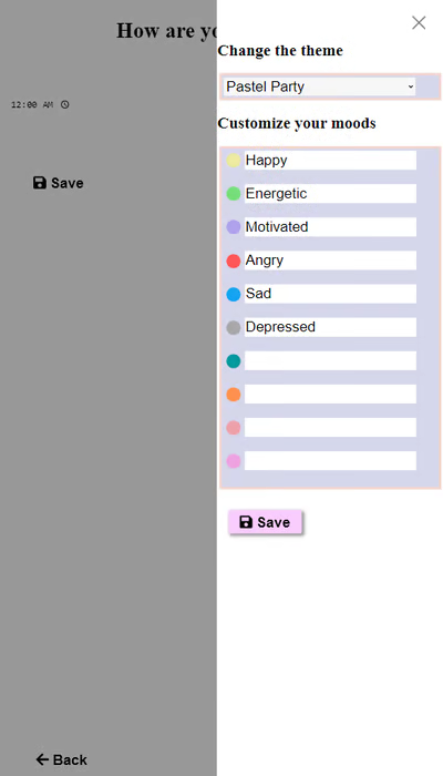
While we had many ideas of features to add to our app, we also had the presence of mind to know that we needed to avoid feature creep, especially with a small development time. We limited ourselves to the features we thought important as well as performed well in user testing with paper prototypes. Some of these features were the mood tracker and giving the user the option to customize their moods to track what was important to them.
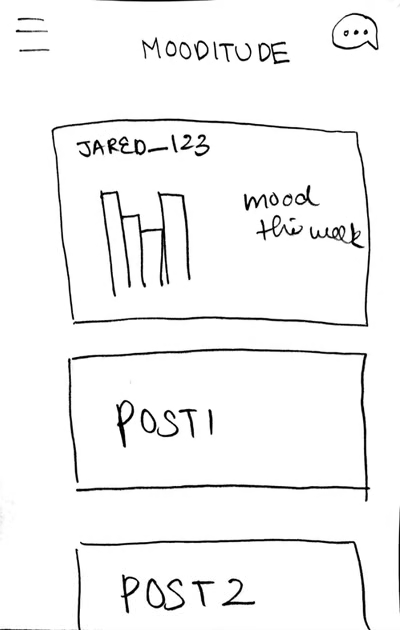
Some of our early designs for Mooditude. Here we can see a home screen and profile page. While these are rather low fidelity, they allowed us to envision how our final product would handle and feel.
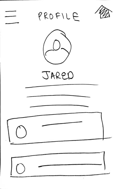
These are a few more paper prototypes that are demonstrating a potential social element in our app. What we found out from the prototypes and user testing was that many users did not enjoy the chat feature, so we learned that we move in a different direction.
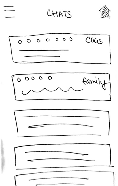
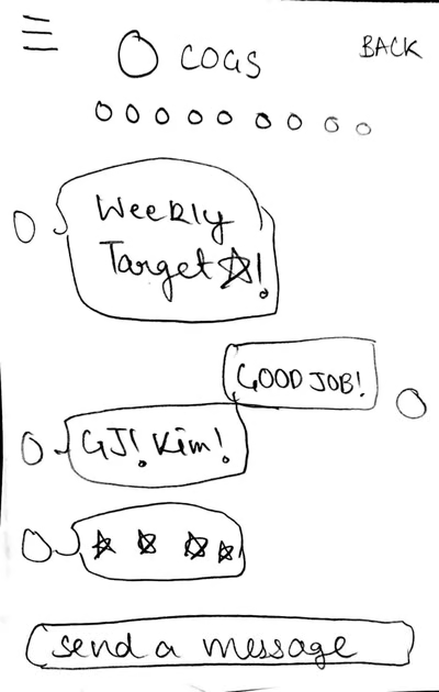
One feature that we were passionate about was exploring how a social aspect to the app could incentivize users to keep journaling. What we found in user testing, however, was that many users were uncomfortable with the idea of sharing journal entries on social media and most said that they probably wouldn't use this feature. Learning about this early on allowed us to redesign our app with these concerns in mind before it was too late.
We decided to implement different color themes because users liked the idea of being able to personalize their journal, much like the way that someone might choose and a personalize a physical journal to suit their preferences. What we learned, however, was that we had to be careful with how much freedom we gave the users to customize their journal since we had to ensure the quality of our app's visual design. To solve this, we created curated themes for users to choose from, allowing them to change the look of the app to fit their style while maintaining the visual integrity of our app.
Are we even doing this right?
Testing and Prototypes
Throughout the entire design and development process our decisions were determined by the feedback we got from testing. Whether it was user testing or heuristic evaluations performed by our classmates, we listened to the concerns of our testers on how to design our app. Iterating from storyboards, to paper prototypes, to wireframes, to the final product, we were constantly updating every aspect of our app.
The Fancy Bits
Final Product
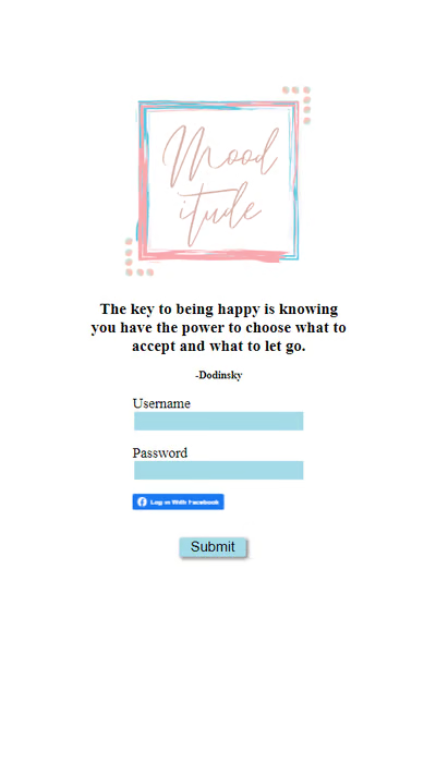
By the end of the 8 weeks, both me and my teammates had learned much about what it takes to design and develop an app. This app, being my first experience with actual software development as well as with HTML, CSS, and Javascript, was a extremely valuable learning experience for me. Not only did I learn about the principles of Interaction Design, but I also learned many things about web development that will be helpful in future projects, things that can only be learned through trial and error and experience. Additionally, because of my time spent on creating Mooditude, I have gained many insights and tricks for developing journal apps and customization features that will be invaluable for upcoming projects.