Figma Redesign
UI • UX • Research • School Project
Team Members: Eric Ko, Yifei Zhang
Why we're Here
Background
Figma is a great and easily accessible application that can be used to quickly make a design or build prototypes and interaction flows. While Figma is popular and enjoyed by many designers, there are some things about it that could be better.
As Computer Science and Cognitive Science students we are used to struggling when using new software tools and applications and Figma was no exception. We want to help others learn these tools in an easier manner than we did and we found that there was no better place to start than Figma. As Figma was recently acquired by Adobe, now is the perfect time to research what major changes can be made to make the program better. By making Figma more accessible to new users, Adobe can expand on Figma’s existing market of designers by easily and smoothly transitioning users from the Adobe ecosystem.
Surveying the Masses
Research Methods
To prepare for this project, we wanted to ascertain what tasks and functions new users struggle with in Figma through research. Specifically, we wanted to find the tasks that new users struggle with the most, the type of resources that users rely on, and what experienced users wish they had known when they were just starting out. By doing this we hoped to find ways that we could improve the app to make it more user friendly. To accomplish this we performed a mixed method approach of direct observations and interviews. The direct observation method was helpful as we could observe new users to Figma and what they struggle with when first starting out. To do this we planned on observing new users as they explore Figma independently and attempt to create a basic design of a prompt we give them. While our focus was on making the app better for new users, we also wanted to interview people experienced with Figma. By asking users that have used Figma professionally questions about their experiences we might gain insight into the project. Some questions we wanted answers to were:
- Is Figma your preferred app to use to design prototypes? Why or why not?
- What are your least and most favorite things that Figma does that other apps do not?
- Is there anything that Figma does poorly or that you struggle with that you wish it did better?
- What advice would you give to new users of Figma?
For this project we wanted to perform direct observations on new users to Figma and interview people with experience in Figma. Both our interviews and observations were conducted individually with a single team member and the user or interviewee. Some of these meetings were done in person, but most were done remotely online. In the end we interviewed three experienced designers and observed five new users to Figma. By gathering data from both new and experienced users of Figma, we gained more diverse information relevant to our project. Experienced users might give us information on tips and best practices for Figma, or give us insight into how to better design our project. On the other hand, direct experience with new users of Figma will show us where Figma fails currently and give us a clear idea of where improvement is needed.
Research Findings
From our direct observations and interviews with Figma users, both new and experienced, we learned a great deal about Figma as an app and how users feel about it. Across the board, we got very positive feedback about Figma and users appreciated how easy it is to use, but there were several areas where users struggled with it or wished for improvements. Specifically, we found from our research that some of the tools were reported to be not very user intuitive. Each of our new users struggled with the color picker and we also heard complaints from 3 of them about the font-family selector. Both elements were said to be hard to use and did not meet what they felt like should be the expected format from other selectors and UI elements in Figma. With the font-family selector, one user said that it was overwhelming with too many options and there was no easy way to tell what each font was and what it looked like. New users also struggled with the controls, with specific examples such as the lack of an undo button and hard to use mouse controls. Furthermore, these new users found some tools to be labeled or represented in a way that did not match what they expected from using other apps, and other tools were hard to access, hidden deep in menus. One example was Figma using “Stroke” as a label instead of “Outline.” Across our users we found that Figma has a learning curve with such issues as hard to find documentation, struggles with properly making interactions between objects, and frames and layering being confusing to newer users.
In addition to the flaws we learned about, we also identified many things that users like and what they wished Figma had. By far the thing we got the most feedback on was in regards to tutorials and documentation. We found that users like demonstrations, videos, and tutorials for how to use a tool, but live demonstrations can be hard to understand at times, depending on the format. An interviewee commented that Adobe has a history of doing well with cloud based and in-app tutorials so these are good features to look into due to their acquisition of Figma. Some other suggestions include a “Microsoft Word” type of font-selector and more customization options for the UI to help improve accessibility. Users, however, recognize the importance of keeping the app lightweight and easy to use at all times and do not want the app to get weighed down by too many or too intensive of features. Finally, we had desires from users that they would like to see some of the more advanced Figma tools like components, plugins, and styles to be recommended to users earlier. One interesting piece of feedback was that one interviewee suggested that for new users to Figma, it might be better to start with FigJam, a scaled down version of Figma that is similar to Miro and other collaborative whiteboards. They proposed that FigJam might be more user friendly and intuitive and also less intimidating than Figma, while keeping all of the core features from Figma.
In summary, while we found that users enjoyed Figma and think it is one of the leading apps in it's market, there are a few areas where we felt it could be improved due to what we learned from our user research. Primarily, users want better and more thorough documentation for Figma, including different types and varieties of tutorials. Since Figma was acquired by Adobe, these types of tutorials are now on brand for the ecosystem that this app exists in. Users also want clearer controls and UI elements with some reporting that they would like to see more accessibility and customization options for its UI. While users want to see changes and improvements, they do not want to see any drastic changes to the app. They like that it is easy to use at any time and is much faster and intuitive than other similar applications.
The Planning Phase
User Personas
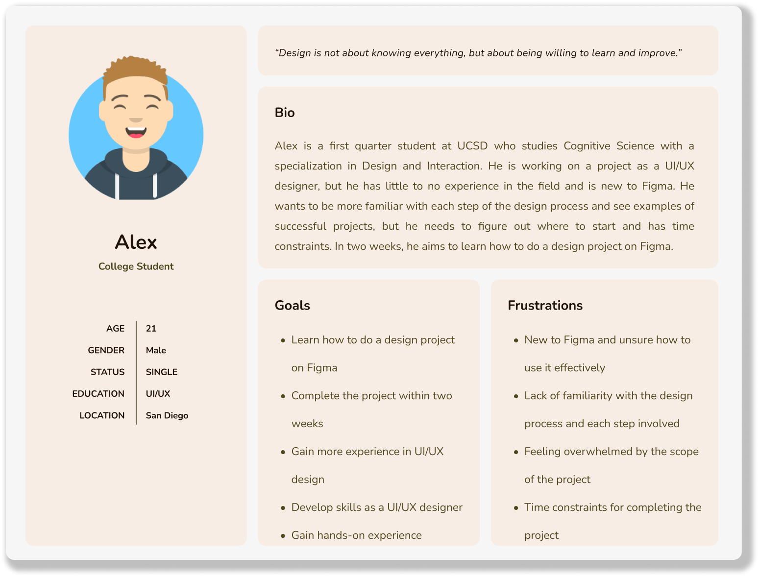
Alex the new designer: Alex is a first quarter student at UCSD who studies Cognitive Science with a specialization in Design and Interaction. He is working on a project as an UI/UX designer, but he has little to no experience in the field and is new to Figma. He wants to be more familiar with each step of the design process and see examples of successful projects, but he needs to figure out where to start and has time constraints. In two weeks, he aims to learn how to do a design project on Figma.
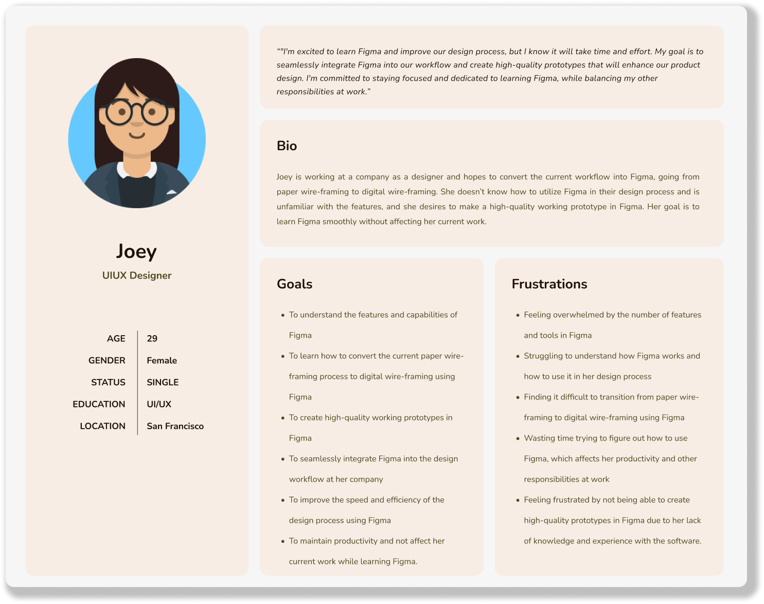
Joey the “Never Figmaed before”: Joey is working at a company as a designer and hopes to convert the current workflow into Figma, going from paper wireframing to digital wireframing. She doesn’t know how to utilize Figma in their design process and is unfamiliar with the features, and she desires to make a high-quality working prototype in Figma. Her goal is to learn Figma smoothly without affecting her current work.
Competitive Audit
UX Flows
UI Sketches
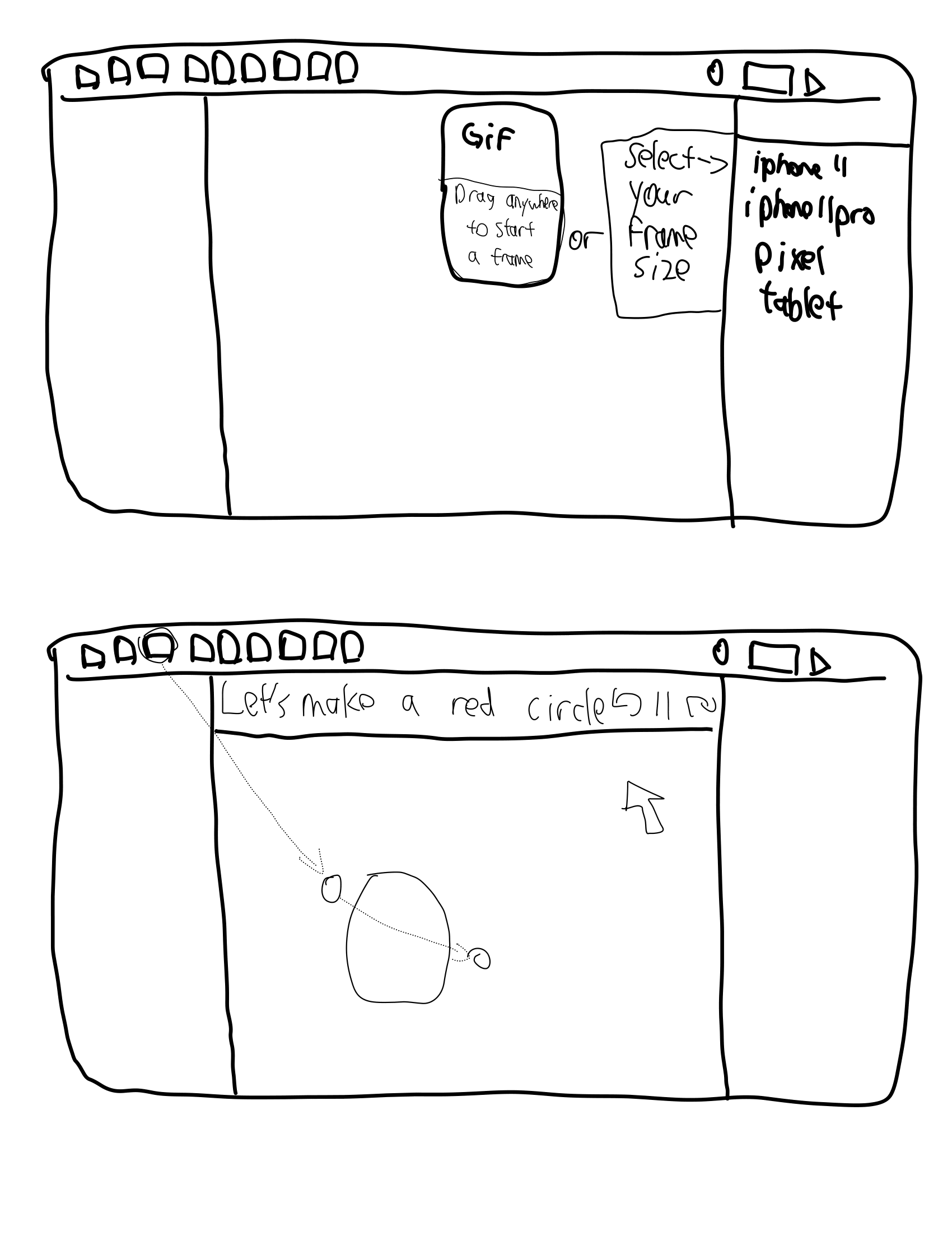
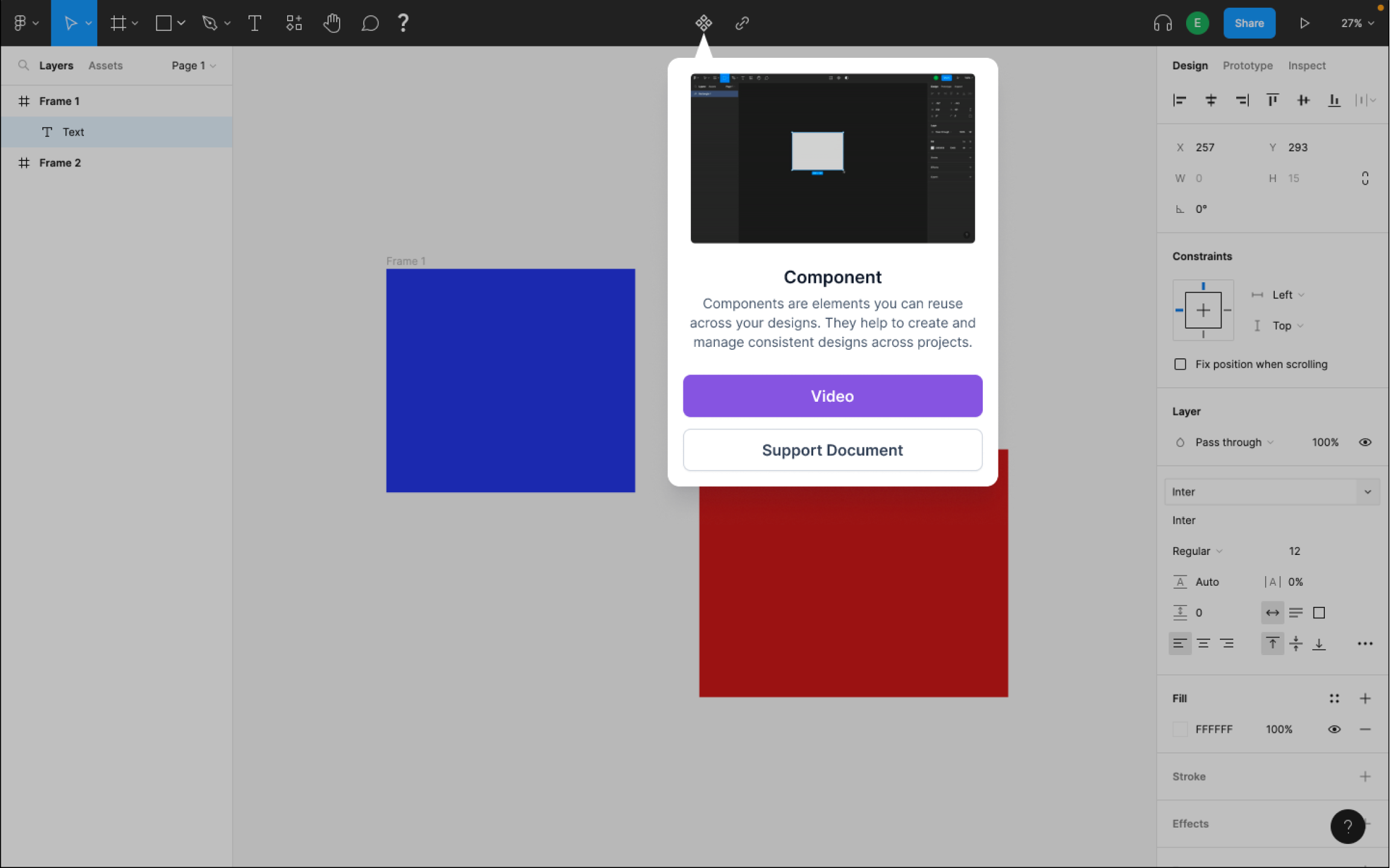
Some examples of how the automatic popup will look like and how the tutorial interface will look like. Also some examples of how users will interact with the overlay tutorial.
These UI sketches showcase what built-in in-app tutorials might look like. From pop-ups that display the functionalities of tools to a help button that will help diagnose user’s problems and recommend solutions. It also provides links to the appropriate video guide or documentation published by Figma themselves.
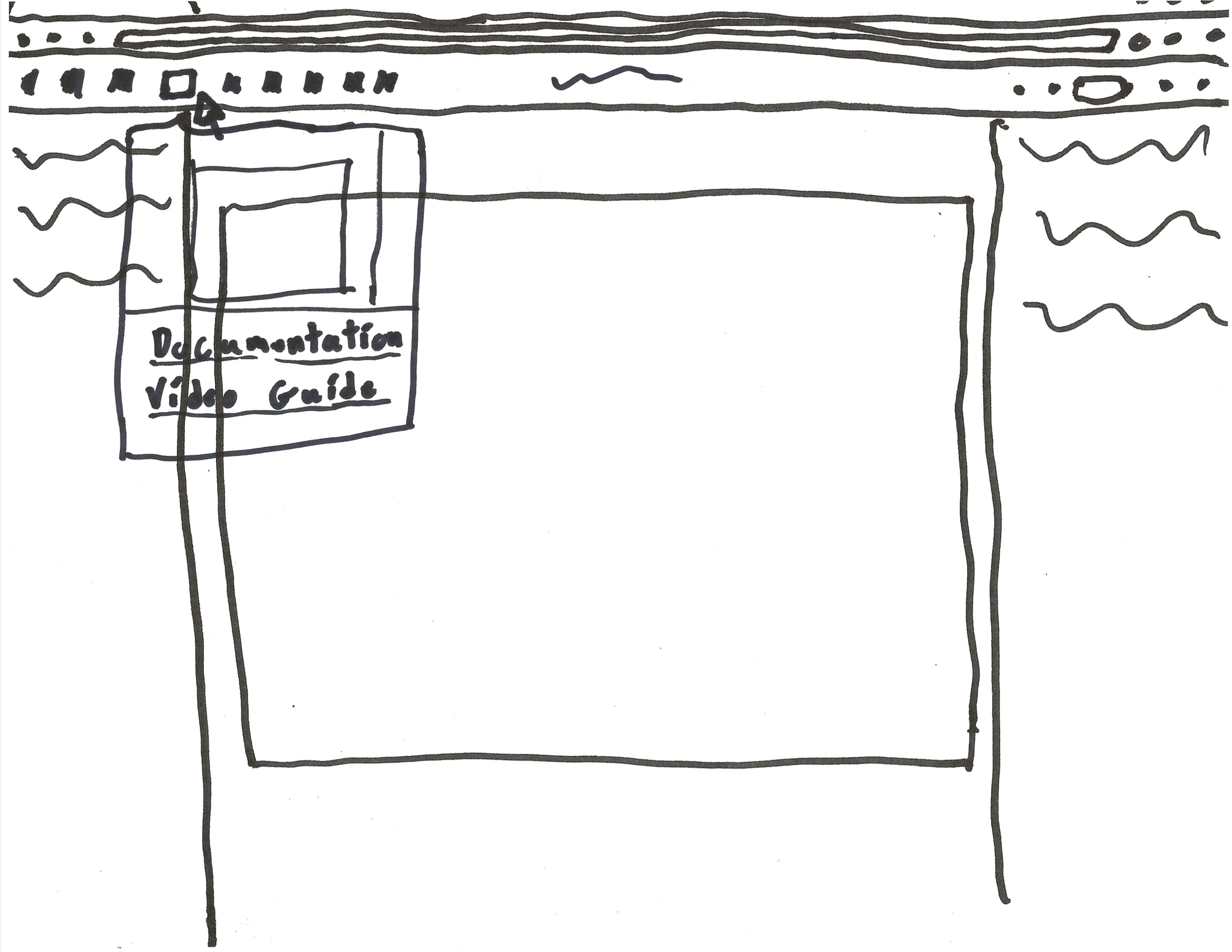
The nice thing about UI sketches is that we get to see just how much of an impact a small change can have on the app. Simply changing Figma’s basic UI layout to have a pop-up window for tutorials makes a big difference. By creating so many UI sketches, we got a good feeling of how simple we can keep our designs while still performing the tasks we set out to do. Each grouping of UI sketches is inspired by the respective UX flows. The first set of sketches is supposed to represent a more in-depth tutorial while the second set is more relaxed and allows the user to choose when they want to use it. For both sketches, we were greatly inspired by the tutorial features we saw that Photoshop had, with them having pop-up tutorials, thorough documentations, and numerous video guides.
Making Progress
Low Fidelity Wireframes
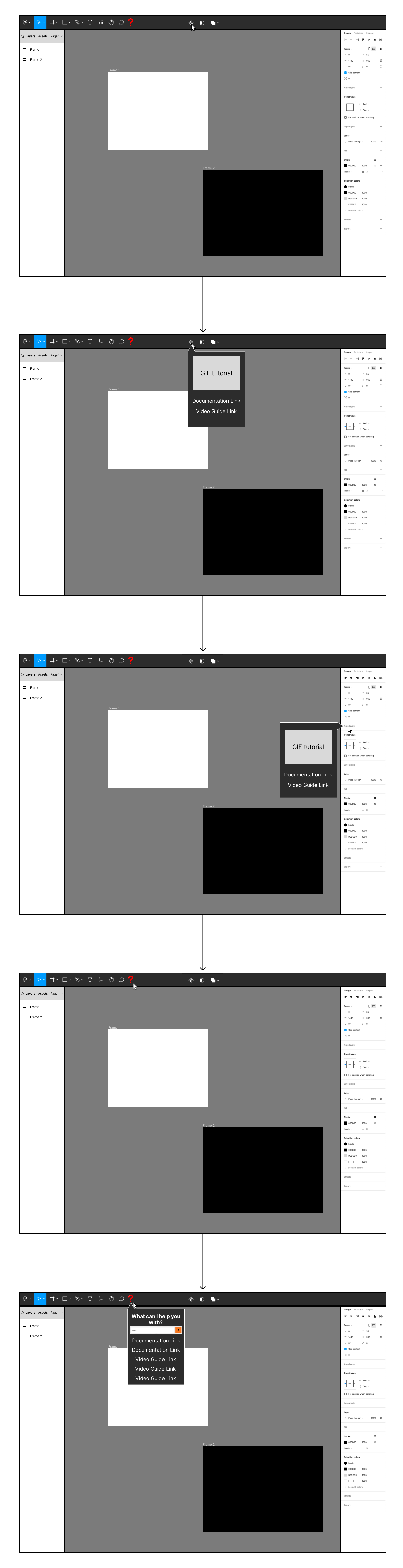
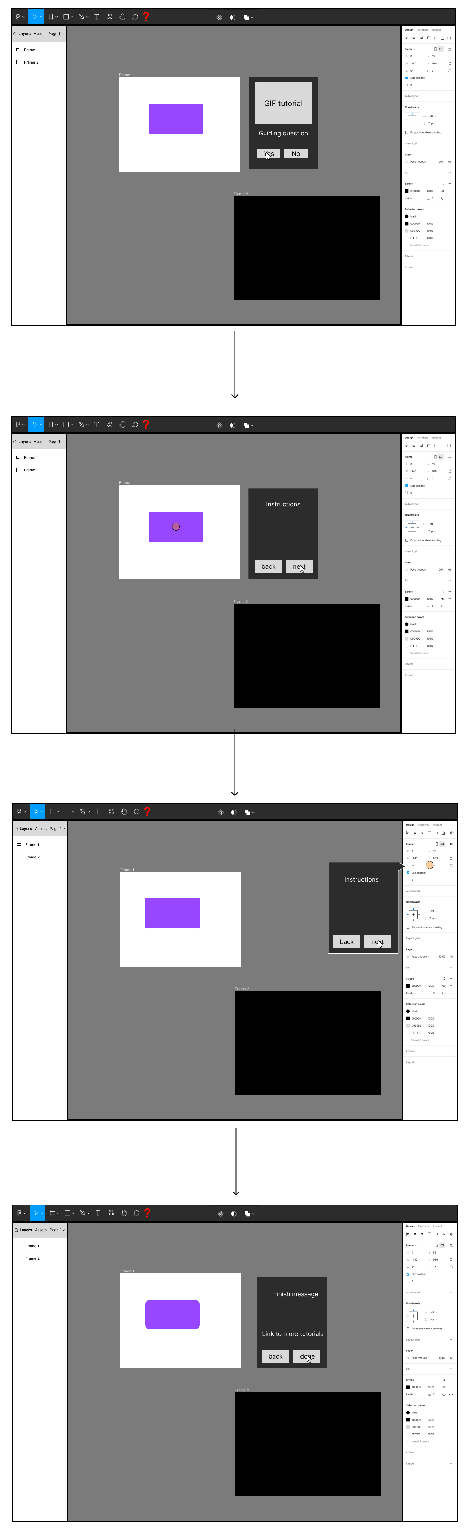
Option A is an iteration on the second group of UX flows and UI sketches previously done. This is a form of tutorial that promotes user discovery. Instead of a guided tutorial, this design features gif tutorials that appear when an element in Figma is hover overed. These pop-ups will have gifs that showcase the functionality of the element as well as links to the appropriate documentation and/or video guides. Additionally, this design features a help element that aims to diagnose a problem the user is facing and suggest ways to resolve it.
Option B is an overlay tutorial, where an orange circle will represent the mouse and show user how to complete a manipulation on screen. The visual approach saves on screen real-estate and eliminates the need to switch windows between Figma and tutorial videos. A pop-up window will also appear on screen, which will show the instruction for that particular step to the user for more details. Users can also control which step they are on through the pop-up window.
User Testing
Interview 1
For our first interview, we interviewed a product designer in his late 20s who has been in the software and user experience industry for many years. Due to his familiarity with the subject, we decided to go into this interview with only a few set questions and focused on reacting to the product designer and asking questions that came naturally to us during the interview. For this, we showed him both wireframes side-by-side and walked him through them before asking for his opinions. Of the two, the product designer greatly preferred option A, with the peek tutorials. In his words “for two-thirds of our users, option B is the weaker option while option A is relevant to all of our users.” In his opinion, option A is useful for new, experienced, or advanced level users, but option B is only useful for new users.
Expanding on his opinions, he did agree that a full blown tutorial that breaks down the entire app would be more useful for new users than peek tutorials. Since it would cover all options, it would be a great starting point to introduce new users to the app. One thing that the product designer strongly suggested was adding a feature to skip parts of the tutorial, or an option to fully opt out of it. He also speculated that it might be better to format this tutorial similar to a course like something that Code Academy offered.
Comparatively, the product designer had far more to praise about option A and less to criticize. He went on at length about the strength of user discovery in apps and how these pop-up tutorials are intuitive and are also situational unlike option B. Additionally, he was impressed by the inclusion of a help button to diagnose user’s problems. This was something he said he has not seen before in these types of apps and is an improvement on other apps with pop-up tutorials like Photoshop. One thing he wanted was a way to query elements with the help tool and get an appropriate response. The main point that the product designer was concerned about was that these peek tutorials can potentially be system intensive or have poor accessibility so he cautioned us to put a great deal of effort to address these issues.
Interview 2
For the second interview, we interviewed someone who is planning on taking Human-Computer Interaction classes next quarter and will be a new user to Figma at that time. Because they are not familiar with the app, we walked them through what Figma can do and how both of our tutorials will work in helping them learn how to use the app. Then we asked them about their opinion on the tutorials and if they felt like they would be helpful to them for learning the app.
The interviewee said that having a tutorial is better than looking at a support document because the tutorial gives them a starting point and makes them feel less lost. The interviewee also said that gifs will be very useful as they can show the user visually what can be done with the tools rather than an abstract description. They think the peek tutorial can be a constant reminder of features that users might’ve forgotten if they are not used often.
One of the fears that the user had with the hands-on tutorial is that many users might come up with similar designs if everyone uses and follows the same tutorial. We think this concern can be somewhat valid and decided that we need to think carefully about what should be included in the tutorial.
Interview 3
We interviewed a first-year computer science graduate student who also majored in computer science as his undergraduate. He did several projects that aimed to better his school community experience. He used Figma to visualize and prototype web apps before the actual production. Since the interviewee was experienced with Figma, we asked him his first impressions of each prototype without guiding him. Of the two, he preferred option A. He thinks that users will be able to find help easily as it's dynamically shown as they explore the app, and that this design is simply more intuitive. However, he mentioned that new users might need to learn what features are included and where to find those features' buttons. This might be a problem for beginners since they can’t watch the tutorial if they don’t hover their mouse on the button. He thinks that option B is easier to get started for beginners, but option A is better for long-term use. He said that even though option B is easier to start, he can’t remember all the features and will need to search for a tutorial after the guide. He said that option A can be helpful for the users to recall and can save time since users don’t need to search tutorials online. He suggested that if we use option B, it is better to include a skip tutorial option for the experts. He also suggested that we can integrate options A and B to fulfill all kinds of users since some users need a complete tutorial to start, and some like to learn as they explore.
Next Steps
From our user testing, we know that the pop-up tutorials were a success and we decided to focus on the first set of prototypes. Additionally, the help button was well received and we want to further look into the functionality of that element. While we did receive concerns about the guided tutorial, we still feel like there might be merit to it if we can properly rework it, but it is not as important as the other features. If we have time and resources, we might want to look into adding accessibility measures and UI options as well, but that is not necessary for a minimal viable product. Finally, there were several concerns about various different elements in our prototypes that we will need to address and resolve in our future designs.
It's all Coming Together
High Fidelity Prototypes
Based on the feedback we recieved from our user research, we found that users greatly preferred our first design that focused on more reactive tutorials. In this design, we had pop-up tutorials that appear when a user hovers over a tool or feature in Figma. These tutorials will showcase the basic functionality of the feature in a gif format as well as provide links to relevant documentation and/or video guides. While we did receive some positive feedback on the more traditional guided tutorial from our second design, we ultimately decided that the potential gains were not worth the time investment into fully designing two different tutorials.
In addition to the tutorial feature, there were some additional features we wanted to add or fix from Figma’s base design. The most prominent of these was the addition of a help tool that will diagnose user issues based on either a text entry or by querying an element in Figma. The former can be done by a simple search function while the latter would produce results by point and clicking on an element in Figma. Other small changes we want to make are small fixes that will improve the user’s experience and make the app more intuitive. One example is changing the font family selector to preview the font before it is selected to make it easier for the user to identify what font works best for them.
Iterated Prototypes
To get feedback on our design for extending Figma we reached out to 3 different types of users to get varied feedback. For this round of user research we had a new user to Figma, a college student with some experience in Figma, and a professional designer with extensive experience with Figma.
What we found was some interesting feedback, with some feedback that covered very large and broad topics while other feedback was more focused and smaller in scale. Some examples for the latter would be how in some places our design did not fit well with Figma’s UI, such as originally using the color purple for buttons instead of blue which Figma normally uses. Some other pieces of feedback were about the text we used in places and suggestions for how to revise them, or on our UI design and on what worked and did not work.
One particular nitpick that we got had to do with how we built the pop-up in Figma. Admittedly, this was our mistake and one we were aware of, but it was not important since we were only displaying images of our prototype and not the prototype itself. Normally in Figma, when you hover over a tool, a small prompt appears giving the tool name, and clicking on the tool will select it or open a drop-down menu. In our prototype, to save time, we simply had our pop-up open when we clicked on the tool, instead of on hover like it was intended. For our revisions we ultimately decided that we wanted to do this properly and fixed it for our final design.
One last field that we received a great deal of feedback on was about how we could increase accessibility in our design. While accessibility is important to use, it is rarely considered when attempting to design a minimal viable product. From our feedback, we decided to incorporate several features to help improve the accessibility in our design. One of the first things was providing an alternative screen that would show that our pop-up tutorials would work in dark mode as well as light mode. Since Figma has keyboard shortcuts, we wanted to include a way to help remind users that they exist so we included a menu that would remind users of them. Additionally, while gifs in our pop-ups can be helpful to many users, there are some users that are sensitive to motion or would have a hard time understanding the gifs. For these users we wanted to include an option to collapse the gifs in the pop-ups so they would only show the video and documentation links. Lastly, we considered giving the user the option to customize their toolbar, but this was unfortunately too ambitious for the scope of this project but is a feature we would like to re-examine in the future.
Finished Prototypes
Before and After
From user feedback, we wanted to make a change to the way we did pop-up tutorials to give the users more options and make it more accessible. While gifs can be great to showcase how the function might be used, they can also be system intensive or abrasive to people with motion sensitivity for instance. To help alleviate this we included a way for users to collapse the gifs on the pop-up tutorials.
While we were happy with the first stage of our high fidelity prototypes, it was clear that there was much we were lacking, specifically refinement. In this version we hoped to move closer to matching Figma’s actual design with our extended features. Here you can see some of the UI changes we made to better match Figma’s UI as well as look better to the user. We also made the buttons responsive to user interactions to give the user positive feedback.
.png)